KUAI CHAO
Art Director - Midnight Design
Design - I Chan Su、Yi Gu
Photography - Mo Chien、王耀賢〈食品攝影〉
Print - 九水印刷
Typeface - 文鼎字型
Paper - 聯美紙業、長瑩紙業
Client - KUAI CHAO
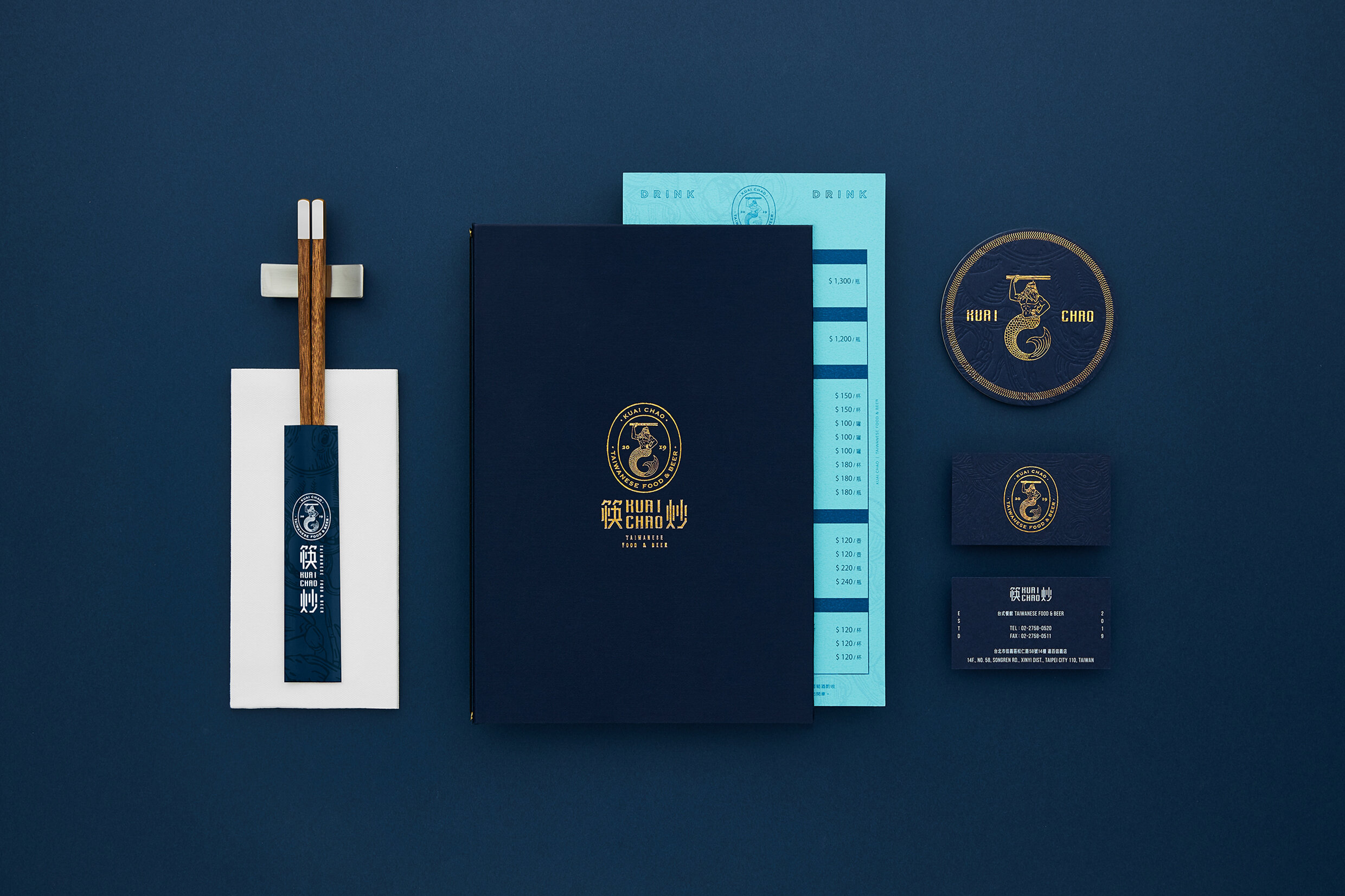
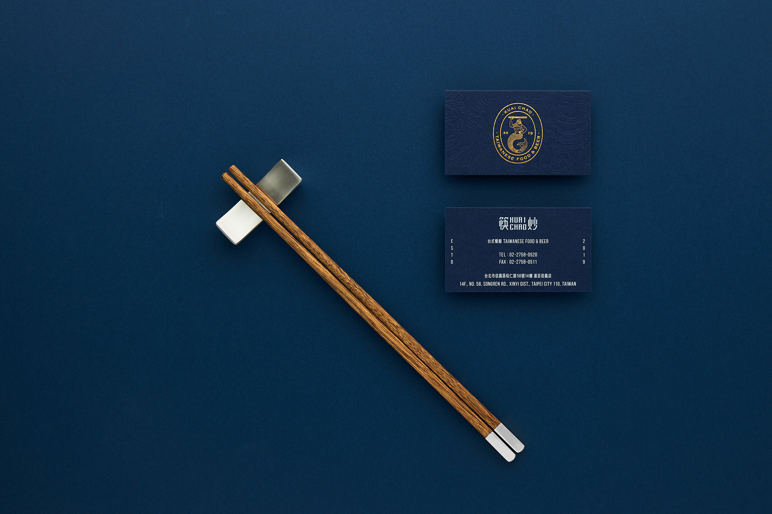
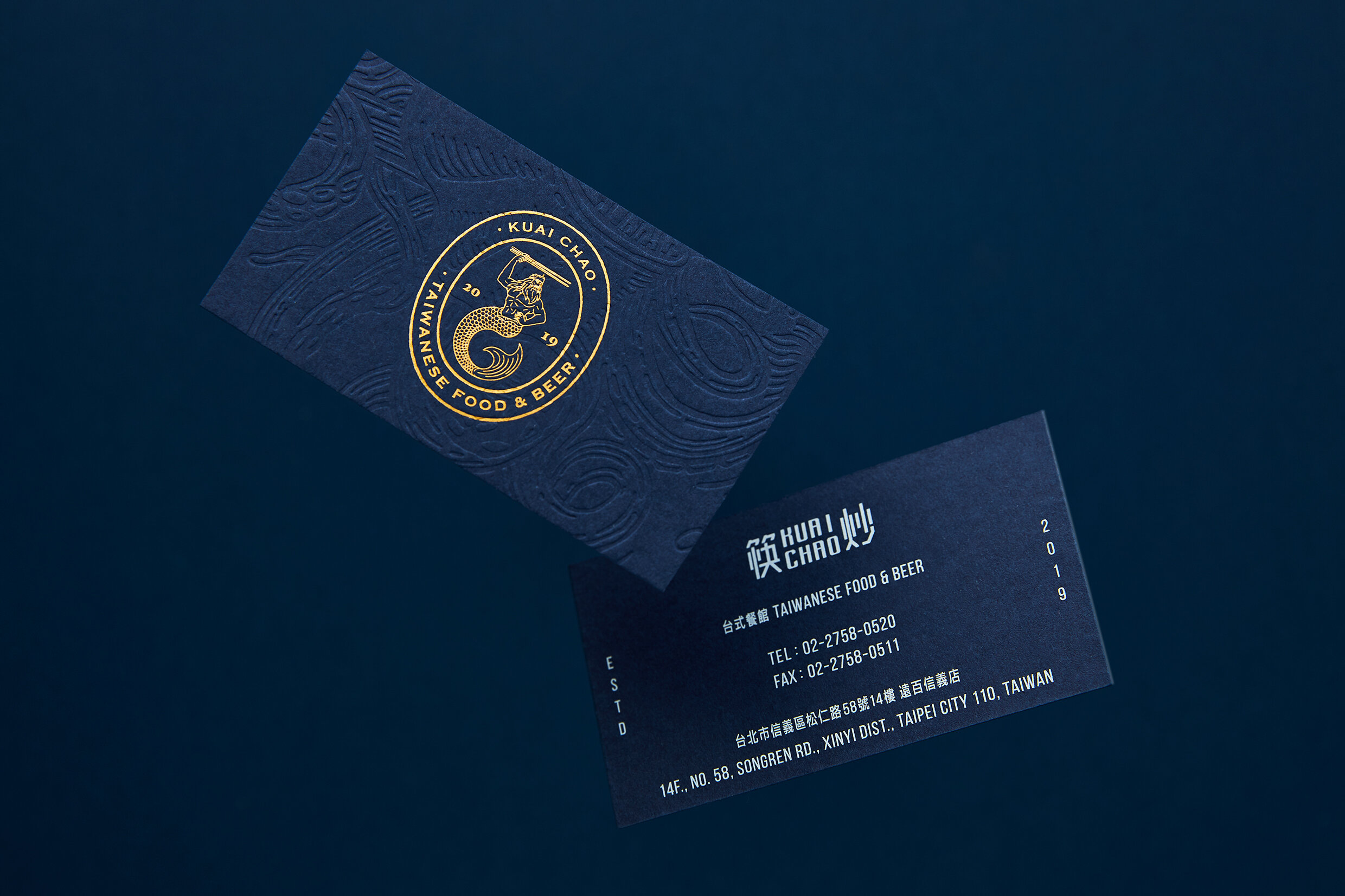
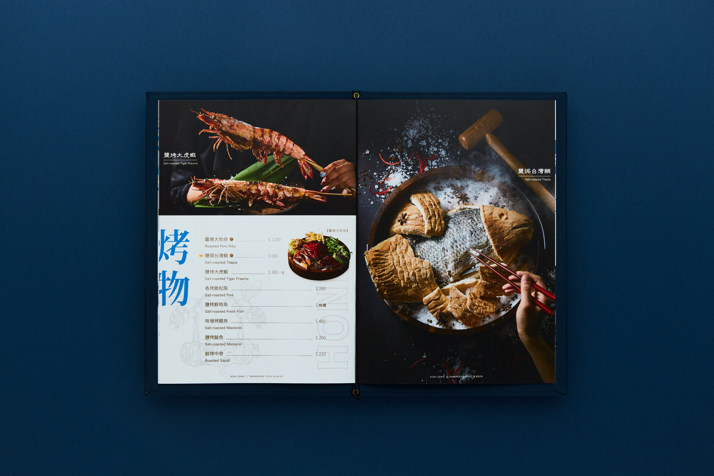
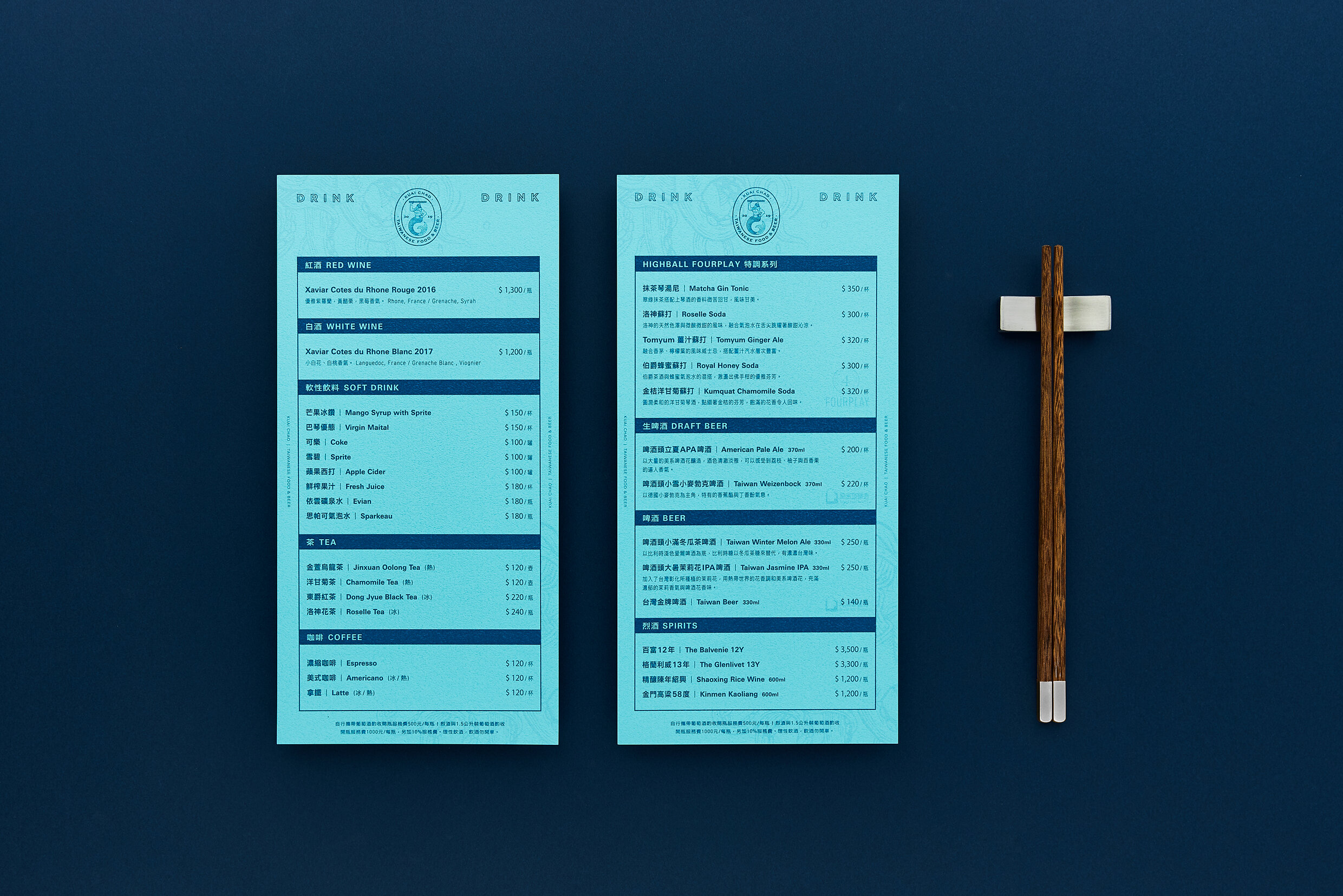
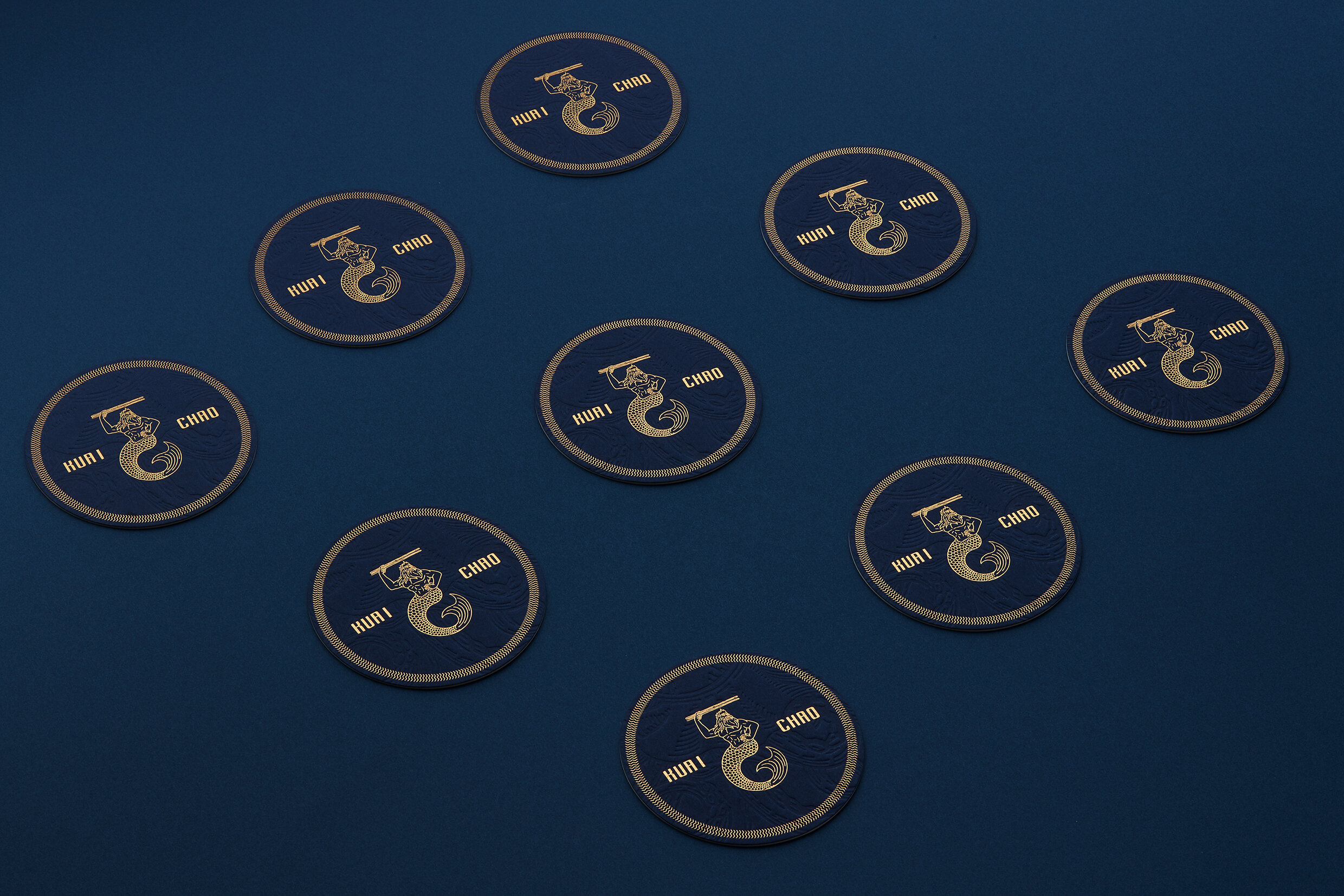
筷炒,是台灣特有飲食文化的 2.0 版,將新潮的熱炒美食搭配異國創意調酒,融合東西方文化的獨特美學,讓快炒文化能有更時髦的嶄新體驗。品牌以簡約的西方復古風格詮釋,並將店內各種特色食材繪製成令人玩味的插畫作為主視覺。品牌標誌的靈感來自於主廚拿手的海鮮招牌餐點,將西方著名的海神波賽頓拿著象徵東方的竹筷,並以徽章式的架構的呈現,除了延續東西融合的核心價值外並帶點讓人會心一笑的巧思,豐富了筷炒細膩精緻的視覺饗宴。
Kuai Chao is a 2.0 version of Taiwan's unique food culture. It serves trendy stir fry with exotic and creative cocktails. By integrating the exceptional aesthetics of eastern and western cultures, stir fry turns out to be more stylish and distinctive. The brand image is presented in a modest western vintage style. All characteristic ingredients are illustrated to be the Key Visual. The brand logo is inspired by the chef's special seafood dish. Poseidon, the famous god of the sea in ancient Greek carries the bamboo chopsticks that symbolizes the east culture, is placed in the middle of badge as the main structure of logo. In addition to the continuation of the core value of the integration of the east and the west culture, the image delivers amusing details which enrich the delicate visual feast.